Mobil App
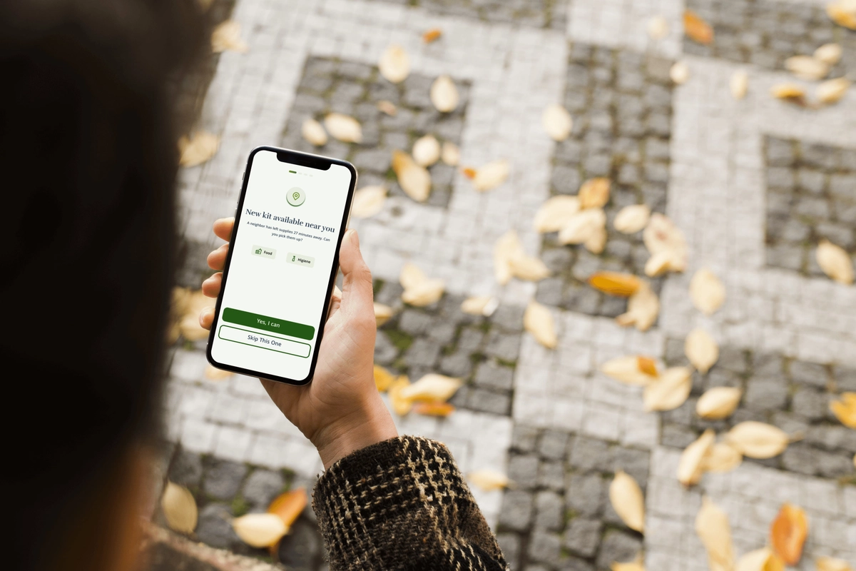
GILDI
Gildi is a mutual aid network in Katy, Texas, designed to eliminate invasive tracking and social stigma.
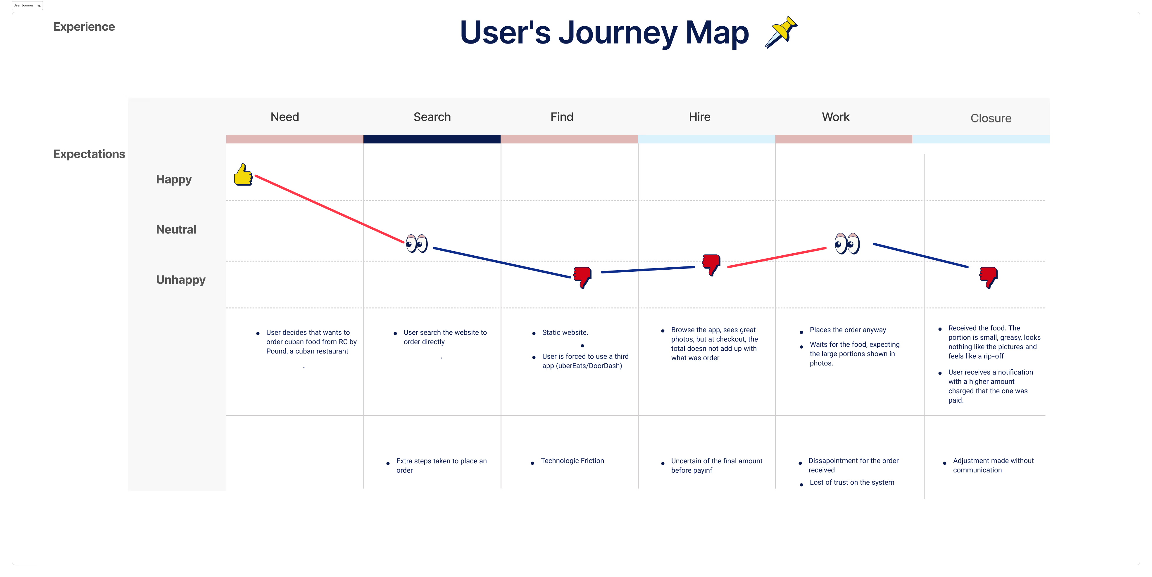
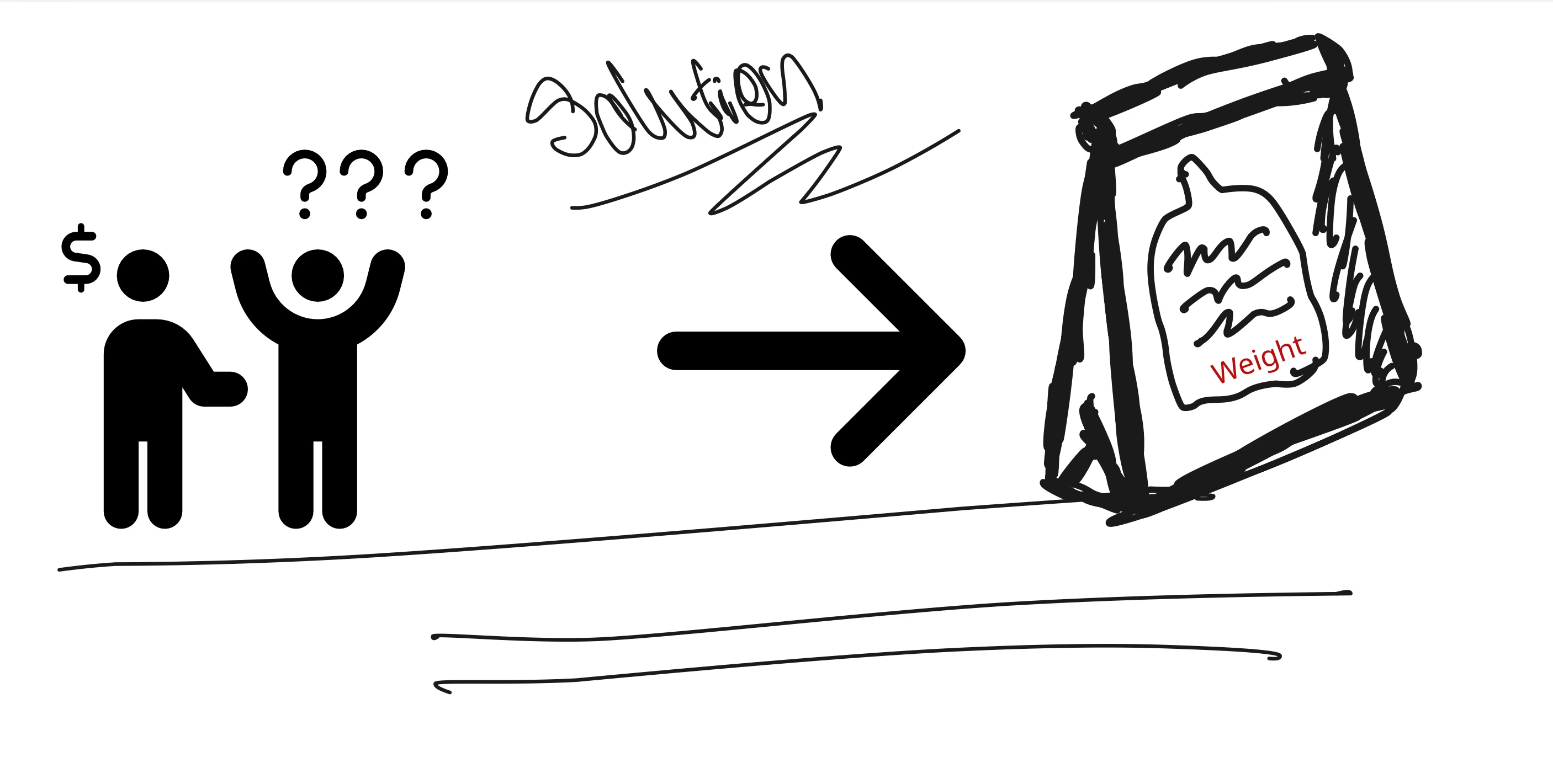
View Case StudyRC by Pound, a Cuban restaurant in Houston, is currently grappling with a reputation crisis. While some patrons rave about the authentic Cuban flavors, others report issues ranging from unexplained price discrepancies to portion sizes that don't match expectations.
To understand the friction within the RC by Pound experience, I conducted a two-phase research process combining public sentiment analysis and deep-dive user interviews. I began by analyzing existing customer feedback and identified that customers weren't just complaining about high prices, but about the total lack of predictability since users described the payment process as tricky where the final amount was always a negative surprise. I interviewed 5 frequent customers to map their journey. The most significant discovery was a Consciousness Gap: most users were not even aware they were ordering food by weight. Users approached the menu with a fixed-price mental model, like ordering a burger, rather than a variable-weight model like buying produce.Because the interface never explicitly explained the weighing process, any post-order price adjustment felt like a hidden fee or a scam.
"The prices are discordant and seem to fluctuate without any explanation. You never know what the final bill will actually be."
“The portions were small and excessively greasy. It was hard to enjoy the meal when everything was dripping in grease.”
"Disappointing experience. The lack of brand integrity is evident; they lure you in with great photos but deliver subpar food."
"It feels like a rip-off when the physical experience doesn't match the digital promise."
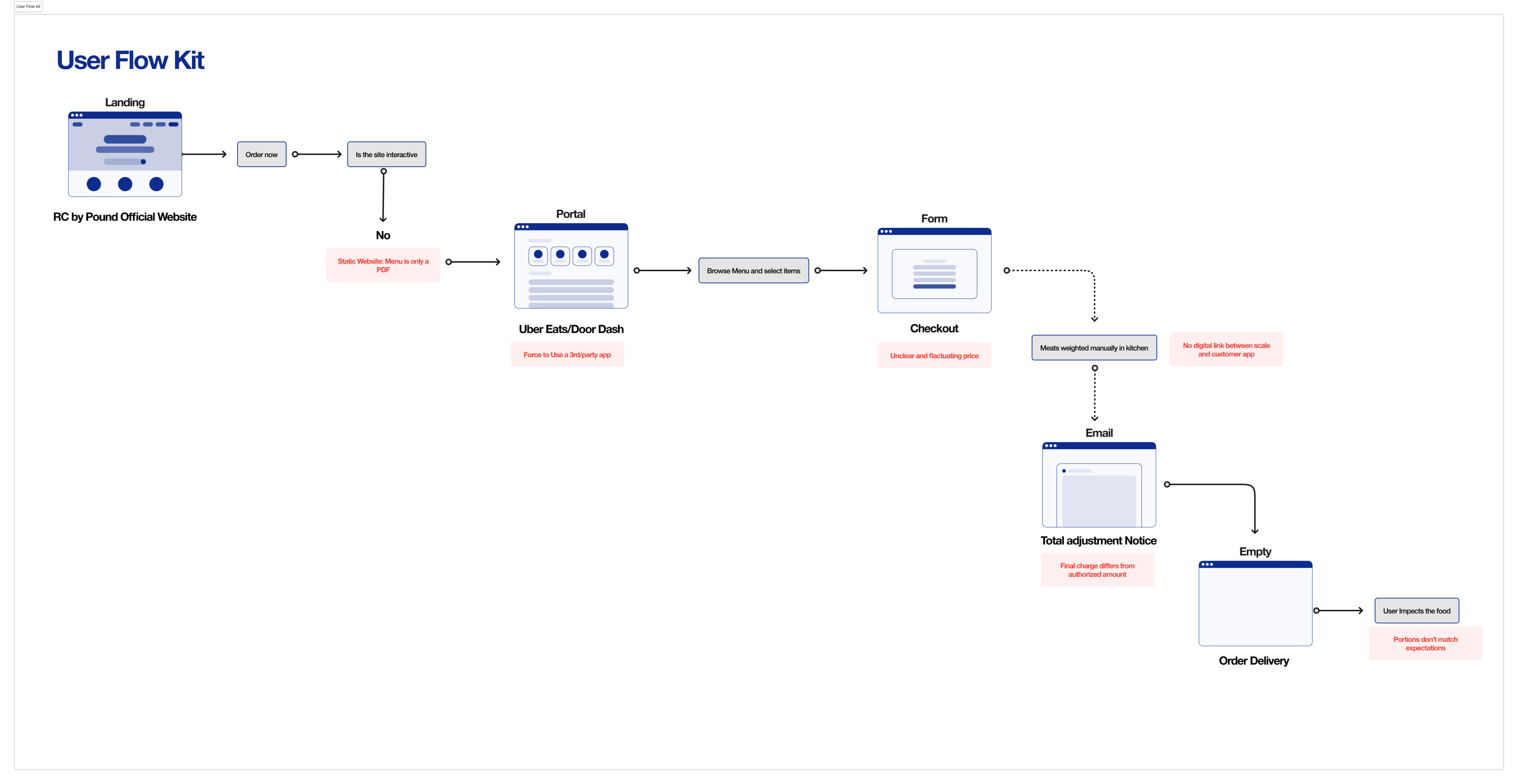
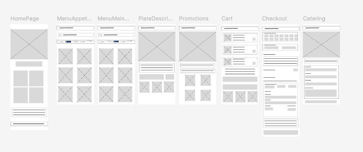
To better understand the users needs, frustrations and how neccesary a functional interface is, I create a mind map to visualize both steps the user takes during the expirience and the points of friction.
Expectation Dissonance.
Price Opacity and Discrepancy.
Availability Uncertainty.
Communication Friction and Operational Lag.
The user journey extends beyond the digital realm. Because RC by Pound is primarily a pick-up system, customers often interact directly with staff. A recurring issue has been unexplained price changes upon order collection.
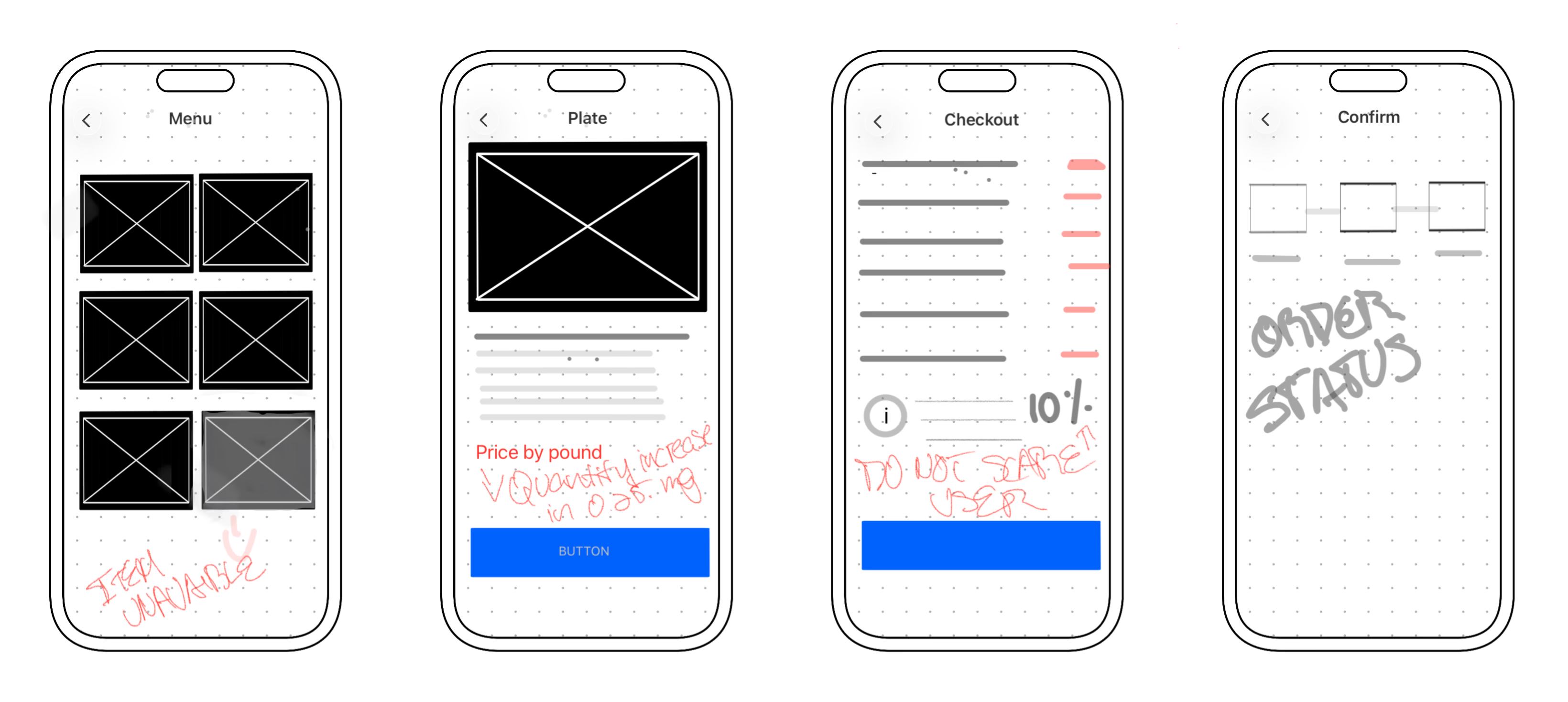
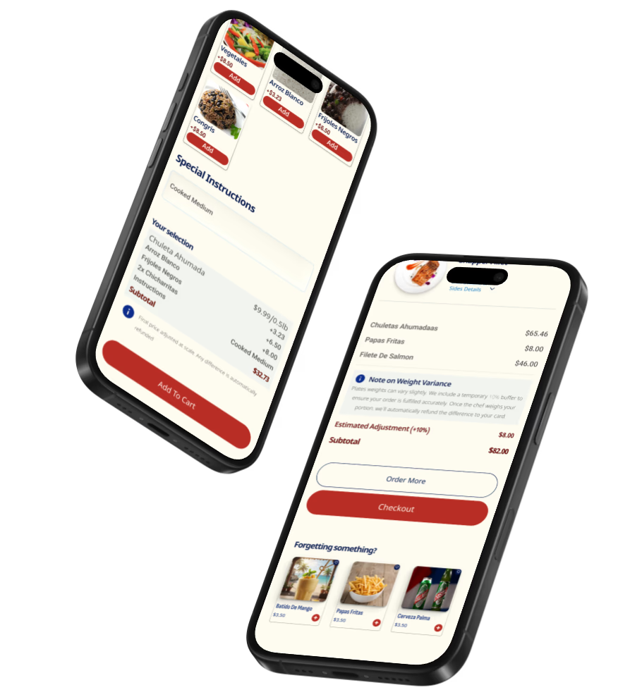
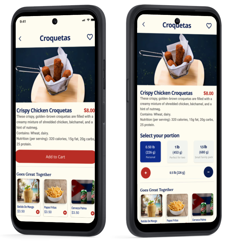
I decided to go through the path of precision and transparency by eliminating terms like serving size and implementing the restaurant brand, by pound, with quantities that start at 0.50lb, 0.75lb, 1lb, and adding the grams to avoid confusion and a small reference, like the personal portion, for sharing portion.
On the Checkout Screen, regarding price discrepancies, I implemented an extra 10% security deposit. The system is transparent: the user pays an estimate, and if the final weight is lower, they receive an automatic refund and a honesty push notification.
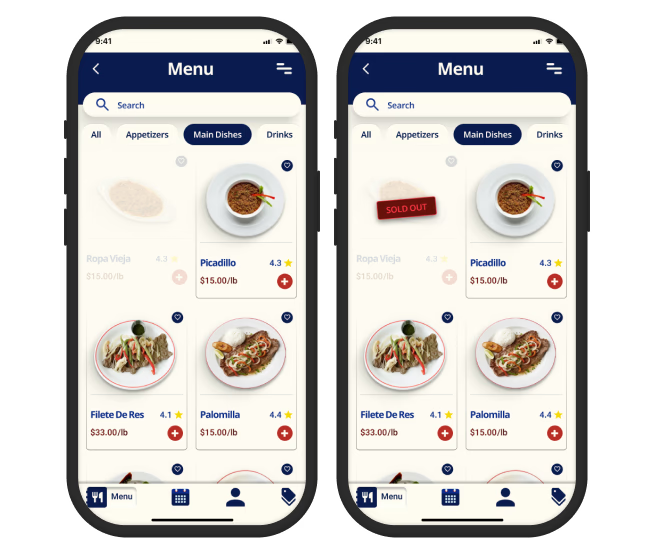
In the menu screen, the solution I implemented was to keep the unavailable items displayed with opacity instead of disappear, which could cause certain level of confusion to the user and at the same time allow to the kitchen staff place the items back on available with just one click.
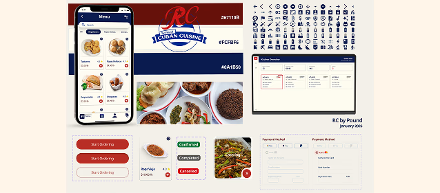
I decided to used the original logo contrast, keeping the roots of the company, honoring their origins and complying with accessibility requirement.
I conducted two rounds of usability studies to validate the weight-centric logic, the app's navigation and checkout flow. The first round identified the best way to make the design as smooth as possible focusing on the main frictions issues, while the second round focused on testing key services and confusion during the final payment steps, as well as testing the newly implemented 'Quick Links' and language accessibility.
Initially, users saw the 10% hold as an extra fee.
To avoid the users think of this as a hidden fee, I added a note on the product details screen to establish the process from the beginning without interrupting the purchase desire.
Users were confused by the opacity of unavailable items. They clicked on the items expecting more information, but nothing happened.
At first, I considered a pop up notification with a message of item not available but, based on system visibility state, force the user to click to obtain information is a unnecessary interaction. Instead I used a batch to indicate the state.
I observed that users found it hard to visualize a 0.5 lb portion. While the 0.25 lb increment offered ordering flexibility, most users selected between 0.5 lb and 1.5 lb.
To simplify the experience, I've implemented preset quantity buttons with visual cues.
Users struggled to find the Reservations page because it was missing from the Homepage. This led them to use the search bar as a workaround to find site sections instead of food items
The confirmation pop-up created a click fatigue and cofusion. Having both, the overlay button and the background button visible simultaneously made users uncertain about which action to take.
Even after implementing Quick Links for Reservations on the homepage, some users missed them. This suggests the need for better visual weight or a more intuitive placement within the primary user journey.
Users were unable to verify their selected sides within the Favorites page. The lack of detailed item descriptions in this section created uncertainty, as users could not confirm the specific components of their saved dishes.
The data showed that a “Reservations” button needs to be present at multiple touchpoints, not just the home, as users mental models for booking vary.
The usability studies shifted my perspective from designing for a 'generic user' to solving for specific behavioral intents. Identifying that users attempted to use the Search Bar to find the Reservations page taught me that Information Architecture must align with the user's mental model, not just the brand's structure.
Simplifying the 4-page customization process into a single-screen interface was a pivotal moment. I learned that reducing 'interaction cost' is just as important as visual aesthetics. In a food app context, every click removed is a potential increase in conversion and customer satisfaction.
No design is perfect on the first try. The discovery of hidden 'sides' in the Favorites section during Round 2 proved that even successful features require constant refinement. This project reinforced my commitment to a continuous feedback loop as the only way to build truly user-centric products.
This project addressed real-world operational challenges identified
through market research and user testing, achieving the following
results.
Reduced order errors by 40% compared to traditional phone-in methods through
an automated checkout flow with real-time validation.
Decreased average ordering time from 3 minutes (phone) to 45 seconds (app)
by streamlining the information architecture based on UX Research.
Addressed the 20% loss in potential revenue caused by peak-hour phone saturation
by digitizing the menu and implementing a "one-tap reorder" feature.
Increased user satisfaction and brand loyalty by transforming a frustrating
process into a rewarding digital experience with personalized "Order History"
and "One-Tap Reorder" features.
Increased new diner return rate by 3x by removing the friction of "ordering
for the first time."
I implemented a hybrid language approach to balance brand heritage with functional clarity. By keeping dish names in their original Spanish, I preserved the cultural identity and recognition for the core Cuban audience. Simultaneously, I provided detailed English descriptions to ensure the app remains accessible and easy to navigate for non-Spanish speakers, eliminating guesswork during the ordering process.
I maintained high color contrast ratios and used a structured hierarchy of headings to ensure that the interface remains legible under various lighting conditions.
I validated my color choices using WCAG 2.1 standards to ensure maximum readability. My primary heading color (#0A1B50) achieved a 15.82:1 contrast ratio, exceeding the AAA level. For Call-to-Action (CTA) elements, I selected a high-energy red (#B92E24) that maintains a 4.95:1 ratio with white text, ensuring that critical interactive elements are clearly visible to all users, including those with moderately low vision.
Gildi is a mutual aid network in Katy, Texas, designed to eliminate invasive tracking and social stigma.
View Case Study
This tool is crafted using OOUX, to enhance the sales process while maintaining exceptional customer service and refining investment decisions.
View Case Study